
Notice.
This article was written in February 2025. The design was updated in April 2025, so the site's color scheme has since changed from what's described here. At the time of writing the base was cream and the accent was wine red, but the current base is white with a dark gray close to black as the accent.
Introduction.
This site's design is built on Bootstrap5's basic configuration — Drupal's design theme. By placing the design components Bootstrap provides, the site design comes together, making it easy to build something that holds up in quality.
My own design sense isn't particularly strong, so the result isn't cutting-edge or especially stylish — but the article readability and the minimal gap between desktop and mobile layouts are both thanks to building with Bootstrap.
This article carries the label of 'design', but it's not about cutting-edge design techniques or CSS and JavaScript code — it's about why the site ended up looking the way it does, colors and all.
To give the conclusion upfront: designing for easy-on-the-eyes ended up producing something close to the packaging of products I use every day — which made me appreciate all over again how well-thought-out classic product designs really are.
1.Bootstrap5.
Bootstrap is a design framework developed and maintained by Twitter, with a history of championing mobile-first design from the very beginning and leading the way in smartphone design. It was also a pioneer of responsive design — converting layouts to suit both PC and smartphone.
Bootstrap5
The site design is built by making small tweaks to Bootstrap5's default theme settings. Being able to do this kind of lightweight customization with relative ease is one of Drupal's strengths. Using Block Layout and the source code editor, design can be assembled simply by writing Bootstrap5's component code directly into blocks.
1-1. Presbyopia.
The gold standard of web design — background white, text black, links blue — has been the standard for internet page design since the early days of the web. Yahoo is the quintessential example of a site built on this scheme.
There are also many sites that achieve a modern look by taking this classic white-background, black-text, blue-link scheme and shifting the text toward gray and softening or retuning the link color.
I love the classic white-background design too, and the site started out that way — white background, dark gray text, and links in a deep, desaturated blue.
Building a website yourself and writing blog articles means a lot of time staring at the browser. Constantly checking layout, text placement, length, and proofreading while writing takes a toll on the eyes — at its worst, the text on the monitor stops coming into focus. I put this down to aging, and what I can only call severe presbyopia.
A slight tangent — my unaided vision is 1.5 in both eyes, so my distance vision is excellent. But I'm also farsighted, which means close-up environments like phone and computer screens produce almost no focus at all. Presbyopia with underlying farsightedness is a particularly rough combination. Reading glasses are non-negotiable for anything on a screen.
1-2. Brightness, saturation, and contrast.
One reason prolonged screen use strains the eyes is that digital device monitors build their images from backlight. Brightness is expressed as luminance, the vividness of color as saturation, and the difference between light and dark as contrast.
The most common web background — white — corresponds to #FFF in HTML. In terms of luminance it's the brightest color, where the backlight is at its strongest. Black text is #000 in HTML, the opposite of white — the darkest luminance value, where the backlight contributes the least.
My thinking is that staring at a high-contrast screen for long periods — maximum-brightness background against minimum-brightness text — is what causes eye strain and fatigue.
Smartphone eye strain.
There's a term for smartphone-induced eye strain, and the backlight issue covered in this article is one contributing factor. But I suspect the bigger culprit is high-resolution displays that emerged after 2010.
The basic idea of high-resolution displays is that each dot is subdivided — into nine, say — to render images more finely. The human eye is impressively capable, so it ends up tracking those fine subdivisions. That constant tracking of finer and finer detail is, I suspect, what accelerates eye fatigue and contributes to vision decline over time.
1-3. Warm-tone design.
With white-background digital screens tiring the eyes, I started thinking about a site color scheme that would be easier to look at. That said, since the site is primarily text, readability has to come first.
Outside of digital content, reading text generally means books, magazines, newspapers — paper media. And on paper it's white with black text, same as screens.
Reading text on paper is less tiring than reading on a phone or digital screen. The reason, I realized, is that digital white and paper white have different luminance. The question is how to replicate that low-fatigue quality of paper in a digital context.
Instead of pure white, the idea is to use cream — a warm-toned white. In RGB terms, warm colors start from R, red. Red and green together give yellow. Building the site's color scheme around that range of tones.
Site colors.
- Base color: cream
- Text color: dark gray
- Highlighted blocks in containers: muted yellow
- Headers of highlighted container blocks: muted orange
- Navigation bar: wine red, with white text on the wine red background
- Link text: underlined wine red, hover color: muted blue
The site's design is built from these color combinations.
The color scheme is written into Bootstrap5's custom CSS.
※ Color charts, custom CSS syntax, and CSS code are omitted here. The official Bootstrap page has detailed documentation — refer to that and give it a try.
1-4. A color scheme I've seen for years.
Cream background with wine red, yellow, orange, and white — a warm-tone combination. And then I realized: I'd seen this color scheme somewhere before.
Mustang Paste and Oronine H Ointment.
The combination turned out to be the packaging of Mustang Paste — an oil for conditioning horsehide leather jackets like military A2s. I have a thing for military gear and own an A2, along with a Buco rider's jacket. Both are horsehide, and Mustang Paste is what I use to soften the leather and treat any scuffs or wear.
It's a product that's been familiar to leather goods enthusiasts for a long time, with a classic American packaging design. The color scheme doesn't just appear on Mustang Paste — it shows up in old American product advertising posters too, and the combination evokes a sense of old-school America.
Japan has its own long-selling product that uses this color scheme. It might come as a surprise, but look closely at Oronine H Ointment and it's the same palette. Oronine H Ointment is a go-to for cracked fingertips or heels in dry winters — something I always keep at home.
This is all quite removed from web design, and I certainly didn't choose the color scheme by looking at Mustang Paste or Oronine H Ointment.
Starting from the desire to reduce eye strain from pure white and black, moving to warm tones and building a palette around red as the anchor color — what emerged happened to look a lot like the old-school American aesthetic of Mustang Paste, and the packaging of Oronine H Ointment, a Japanese household staple for generations.
2.Example Photos.
Reference photos of Mustang Paste and Oronine H Ointment. Colors that are easy on the eyes reflect strong design thinking.

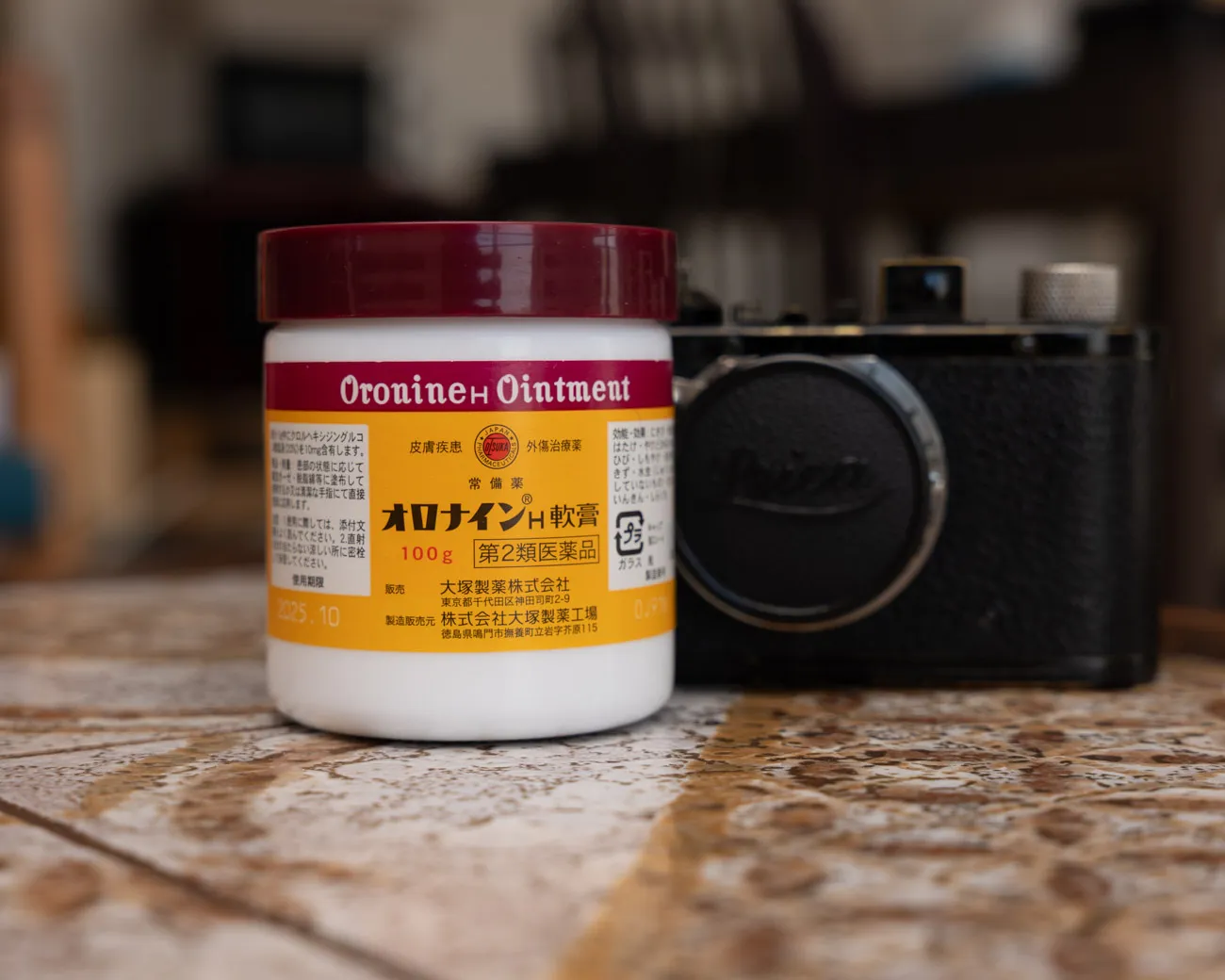
The colors aren't identical, but the combination feels surprisingly similar.
Conclude.
This article ended up being a summary of the site's color scheme. It's a fairly lighthearted topic, but building a website and writing articles means a lot of time in front of the computer — and the eye strain that comes with it genuinely affects how much you can get done.
Thinking about how to solve it, I landed on switching to a color scheme that's easier on the eyes — and from experience, warm tones are less tiring than cool ones. That's how the current palette came to be. Once it was done I realized it looked like color schemes I'd been seeing for years — and while it's not quite 温故知新 (learning from the old), it made me appreciate all over again how impressive the designs of long-standing products really are.
The warm-tones-are-easier-on-the-eyes experience extends beyond the site — iTerm for the terminal, VsCord for the IDE, and Bear for the text editor are all set to yellowish cream rather than pure white, and all of them reduce eye fatigue over long sessions.
This turned out to be a very personal article, but there are many possible goals in web design color choices — this one is specifically about colors that reduce eye strain over long sessions, not about producing an outstanding design.
My knowledge isn't at the level where I can build web designs exactly as envisioned — I'm still learning as I go — but Bootstrap5 provides excellent, practical components, and I plan to keep reaching for them as needed.
While writing about color scheme, it occurs to me that the site has also had some changes to functional elements — navigation, side menus, and so on — where components have been added to Bootstrap5's defaults. These changes fall under site design too and I'd like to write about them, though I'm still working out how deep to go.
My aim is to keep articles concise and clear, but looking at the logs the time-on-page tends to be long — which makes me wonder if the writing is hard to follow, or if there's too much that doesn't need to be there, and whether things are really landing the way I intend.
There's no simple answer to what the right time-on-page is — it varies wildly, from very short to very long, with some probably close to what you'd expect. There's no correct answer, but it's a useful guide for thinking about what goes into each article, and I plan to keep that in mind as I write.
A brief look at Drupal CMS — the test version released at year-end, with the official release on January 15. These are impressions from installing and using the test version on a MacBook. It brings a WordPress-style approach to Drupal, developed to encourage use by non-developer users.