Notice.
This article was written in February 2025. The design was changed in April 2025, so the colour scheme of the site has been changed from the colour scheme described in this article. At the time this article was written, the base colour was cream and the accent colour was burgundy, but the base colour is now white and the accent colour is a dark grey close to black.
Introduction.
The design of this site is based on the basic structure of the Bootstrap5 design theme for Drupal. By arranging the design parts provided by Bootstrap, you can create a website design, so it is easy to create a design that maintains quality.
My own design sense is not very good, so the design is not cutting-edge or stylish, but the ease of reading the articles and the fact that there is not much difference in responsiveness is thanks to the design being built using Bootstrap.
In this article, I'm writing about design, but I'm not going to talk about cutting-edge design construction methods or CSS and JavaScript code, but rather why I chose the design of this site, including the colour scheme.
To cut to the chase, I've made the design easy on the eye, and the colour scheme is similar to the packaging of products I use in my daily life, and I've written about how I was reminded once again that the design of products that have been around for a long time has been well thought out.
Bootstrap5.
Bootstrap is a design framework developed and managed by Twitter, and from the beginning of its development it has been based on the theme of ‘mobile first’, and it has a history of leading the way in smartphone design. It is not only a pioneer in smartphone design, but also in responsive design, which converts web designs to suit both PCs and smartphones.
Bootstrap5
I'm building the site design by tweaking the initial settings of the Bootstrap5 theme, which is the design theme. The advantage of Drupal is that you can perform simple customisation like this relatively easily. You can build the design simply by writing the source code for the design parts provided by Bootstrap5 directly into the blocks using the block layout and source code editor.
1-1.Presbyopia.
The classic standard for web design is a white background, black text and blue link text. This design has been used since the early days of the internet, and a typical website using this design is Yahoo.
You can also see many web designs that achieve a modern design by using a grey colour for the black text of the classic design with a white background and blue link text, or by making the blue link text lighter or changing the tone.
I also love the classic design with a white background, and when this site was first set up, it had a white background, dark grey text and dark blue link text with reduced saturation.
When you build your own website and write blog posts, you end up spending a lot of time looking at the browser screen. As you write, you check the layout, the positioning of the text, the length, proofreading, etc., and this can cause eye strain, and in extreme cases, you may find that your eyes can't focus on the text on the monitor. I think this is a side effect of my own ageing and the extreme presbyopia that has set in.
This is a bit of a tangent, but my eyesight is very good, with 1.5 vision in both eyes. However, because I have hyperopia, I can't focus my eyes at all in situations like looking at smartphone or PC screens, and I can't see properly. This is a typical case of presbyopia and hyperopia, and the symptoms are not very good. Because of this, I always wear reading glasses when looking at smartphones or PCs.
1-2.Brightness, saturation and contrast.
One reason why looking at a PC or smartphone for a long time can make your eyes tired is that the images on digital device monitors are made up of backlighting. Brightness is expressed as luminance, and the word ‘saturation’ is used to express the vividness of colours, while the word ‘contrast’ is used to express differences in light and dark.
The most commonly used background colour for websites is white, which in HTML is represented by FFF, and when considering brightness, this is the brightest colour and the colour with the strongest backlight. Black text is represented by 000 in HTML, which is the opposite of white, and when considering brightness, this is the darkest colour and the colour with the weakest backlight.
We think that looking at a screen with strong contrast for a long time, with the darkest text data on the brightest background, may cause eye strain and fatigue.
Smartphone Presbyopia.
There is a term called ‘smartphone presbyopia’, and the problem of backlighting is one of the causes. However, I think that the biggest cause is probably the effect of high-definition displays that appeared after 2010.
The structure of high-definition displays is such that they express images in greater detail by dividing each dot into nine smaller dots, for example. The human eye is quite sophisticated, so it follows the dots that have been divided into smaller parts. This causes the eyes to follow smaller and smaller details, and I think that this makes it easier for eye strain to occur, and that this is causing a decline in eyesight through everyday use.
1-3.Warm-toned design.
We think that the backlight of digital images on PCs and smartphones is likely to cause eye strain on a white screen, so we will consider making the site design a little more colour coordinated to reduce eye strain. Even though we are talking about a colour scheme that reduces eye strain, since this is a website with text as its main content, the text must be easy to read.
When reading documents other than digital content, paper media such as books, magazines and newspapers are generally used, and black text on white paper is the norm.
Reading text on paper is less tiring for the eyes than reading on digital media such as smartphones. For this reason, we notice that the brightness of white on digital media differs from that of white on paper. We consider how to make digital media less tiring on the eyes, like paper media.
We consider using a warm-toned cream colour, even though it is white. When considering warm colours in RGB, the starting point is the red colour R. Adding red and green makes yellow. We consider the colour scheme of the website based on these colours.
Website colours.
- Base colour is cream
- Text colour is a darker shade of grey
- The blocks emphasised by the container are a dull yellow
- The headers of the blocks emphasised by the container are a dull orange colour
- The navigation bar is a dark red colour, and the text colour displayed on a dark red background is white
- Link text is a dark red colour with an underline, and the hover colour is a dull blue
The design of this website is based on the colour combinations described above.
The colour scheme will be written in the custom CSS, which is one of the advantages of bootstrap5.
* We will not be covering colour charts, how to write custom CSS, or CSS code. There is a detailed explanation on the official Bootstrap page, so please refer to that and give it a try.
1-4.A design colour that has been popular for a long time.
The design uses a combination of warm colours such as maroon, yellow, orange and white on a cream background, but you may notice that you have seen this colour combination somewhere before.
Mustang Oil and Oronain H Ointment.
This colour combination is used on the packaging for Mustang Oil, a product used to care for horsehide leather jackets (such as the A2 military jacket). I like military clothing, and I own an A2 as well as a Buco biker's jacket. Both leather jackets are made from horsehide, and I use Mustang Oil to soften the leather and care for it.
This product has long been familiar to those who like leather goods, and it has a good old-fashioned American-style package design. This colour scheme is not only used on the Mustang Oil package, but is also often used on posters advertising old American products, and when you see this colour scheme, it reminds you of old-fashioned America.
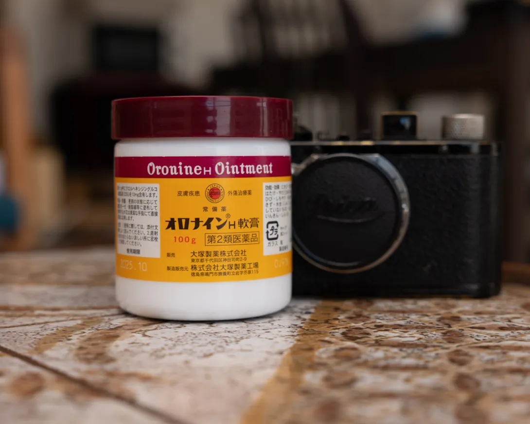
There are also long-selling products in Japan that use this colour scheme. It may come as a surprise, but if you look closely at the Oronain H Ointment, you'll see that it uses this colour scheme. Oronain H Ointment is an excellent product that can be used to treat dry skin and cracked heels in winter, and I always keep some at home.
The design package has nothing to do with the website design, and I myself did not choose the colour scheme from the Mustang Oil or Oronain H Ointment packaging.
Because pure white with black is easy to tire the eyes, I chose a warm colour scheme, and when I put together the whole thing with red as the base colour, the result was a colour scheme that evoked the good old USA, as represented by Mustang Oil, and a colour scheme similar to the package design of Oronain H Ointment, a traditional Japanese ointment that is always kept in the home.
2.Example Photos.


The colour scheme is not exactly the same, but the colour combinations are somewhat similar.
Conclude.
This time, I've put together a summary of the colour schemes used in website design. I apologise for the trivial topic, but when you're building a website and writing articles, you often have to keep looking at the computer screen for long periods of time, and your eyes inevitably get tired, which makes it harder to work.
I thought about whether there was any good solution to this, and I thought that it would be good to use a colour scheme that doesn't tire the eyes, so I ended up with the current colour scheme based on my experience that warm colours are less tiring for the eyes than cool colours. When I finished it, I realised that the colour scheme was the same as one I had often seen in the past, and I was struck by how amazing it is that designs that have been around for a long time and are still used today are not warm and innovative.
My experience that warm colours are less tiring for the eyes is reflected in the fact that I use iTerm as my terminal, VsCord as my IDE, and Bear as my text editor, all of which are set to a yellowish cream colour rather than pure white, and all of which reduce eye strain even when used for long periods of time.
This article is from a very personal perspective, but there are various purposes for colour schemes in web design, and my article this time is about colour schemes from the perspective of designs that are easy on the eyes even when viewed for long periods of time, and not about excellent designs.
My own knowledge is not enough to build web designs as I would like, and I am in a situation where I learn as needed, but Bootstrap 5 has useful and excellent components, so I will continue to use it as needed.
This time, I've put together an article about the colour scheme of websites, but this site has been changed slightly, with components added to the default Bootstrap 5 theme, such as navigation and side menus related to functionality. I'd like to write an article about this from the perspective of website design, but I'm not sure how much content to write.
I'm trying to write articles that are as concise and easy to understand as possible, but looking at the logs, I think that the articles are not being read properly by visitors, as they are long, difficult to read, and contain a lot of unnecessary content.
There is no one right answer for how long an article should be, and there are various cases, including extremely short articles, long articles, and articles that are probably close to the expected length. There is no right answer, but I'm going to write articles while referring to them as a guide for thinking about the content of the articles.
This is a brief summary of Drupal-CMS, which was released as a test version at the end of the year and officially released on 15 January. This is my impression of using the test version installed on my Mac Book. It has been developed with the aim of incorporating WordPress-style policies into Drupal and promoting its use by users who are not developers.